Climate Central

Making climate change data accessible through design

Collaborating to level up website design and functionality.

Climate Central communicates climate change science, effects, and solutions to the public and decision-makers: They work with big data and technology to generate thousands of local news storylines and compelling visuals.

While the organization is cutting-edge and science-driven, their website did not fully convey that. After working with Radish Lab on smaller projects over a few years, the team came to us with a larger challenge: They were looking for a new way to tell their story and to connect more directly with their users – meteorologists, newsrooms, and researchers.

Strengthening the organizational narrative and navigation.

Climate Central’s work generates data, tools, and graphics to inform public opinion. However, the website had a lot of usability challenges: there were too many navigation options, it was complicated to find specific visuals, and there weren’t clear guardrails for how content was added or organized.

Developing and implementing a cohesive, content strategy would be key to the success of the redesign. Through interviews and surveys with staff and stakeholders, we learned a lot. We surfaced the need of potential users, including for example: meteorologists who needed to find a specific, localized heat map for the evening news; public officials who would benefit from visualizing state-wide flood levels; and researchers in need of high-impact climate change visualizations.

This research allowed us to build a thoughtful narrative arc – telling the organization’s story at a higher level – while also designing an information architecture that would allow new users as well as loyal ones, to quickly find the tools, maps, and resources they need.
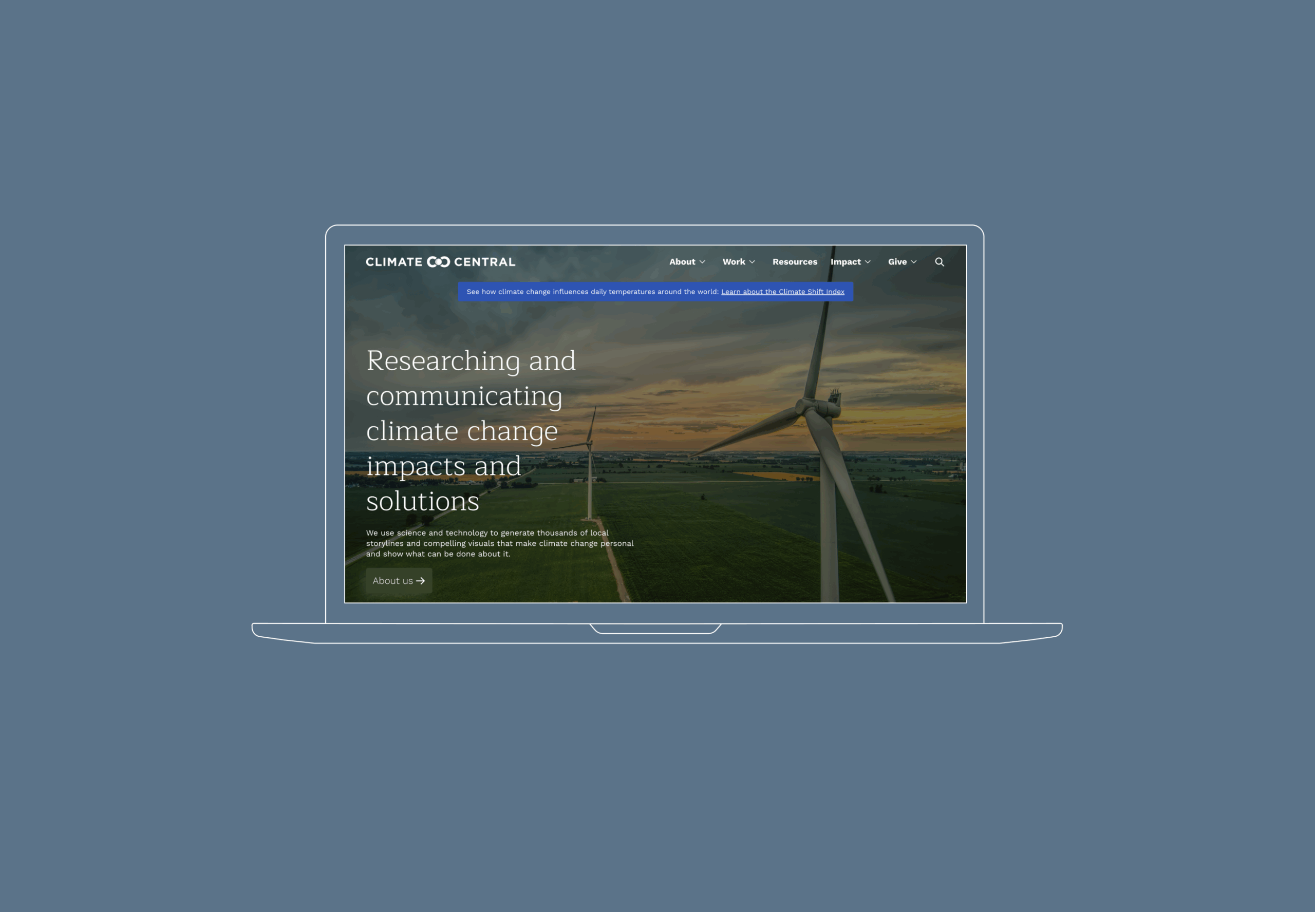
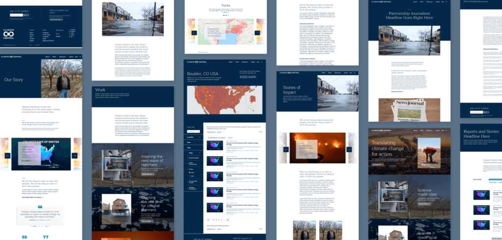
Centering climate change in design.

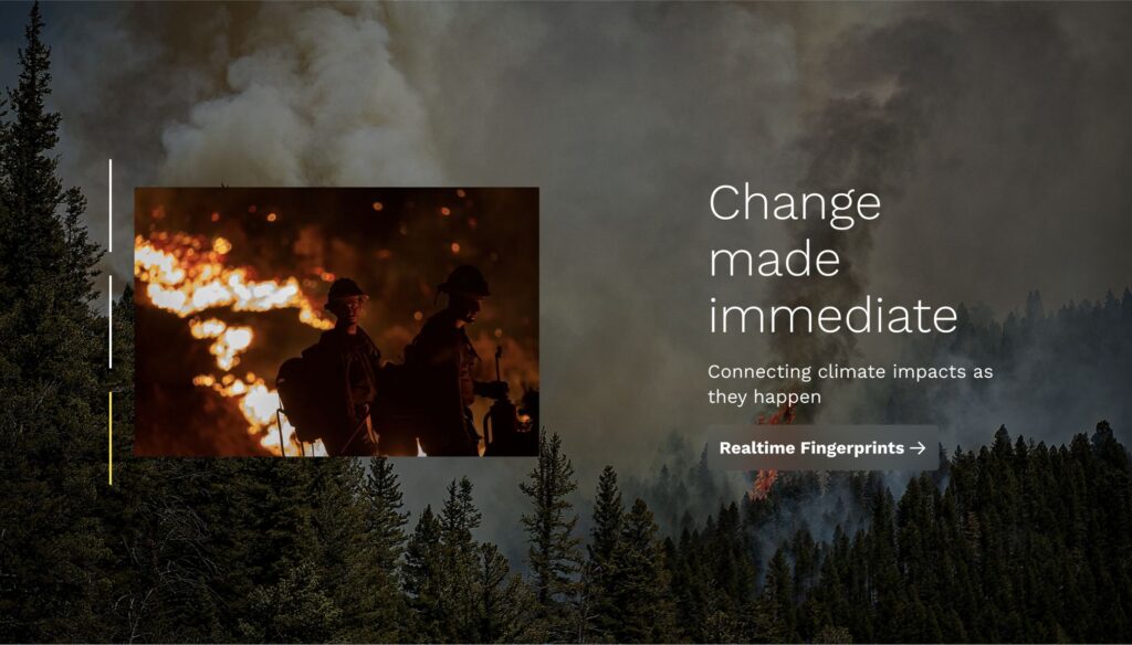
While data-informed mapping is core to Climate Central’s offerings, we knew that the greatest visual impact would come showcasing nature unfiltered.

Through photography, we explored both the global and the personal impacts of climate change: the impacts that are larger than life, as well as the very practical ways in which climate change impacts us.

Developing a succinct, accessible visual system.

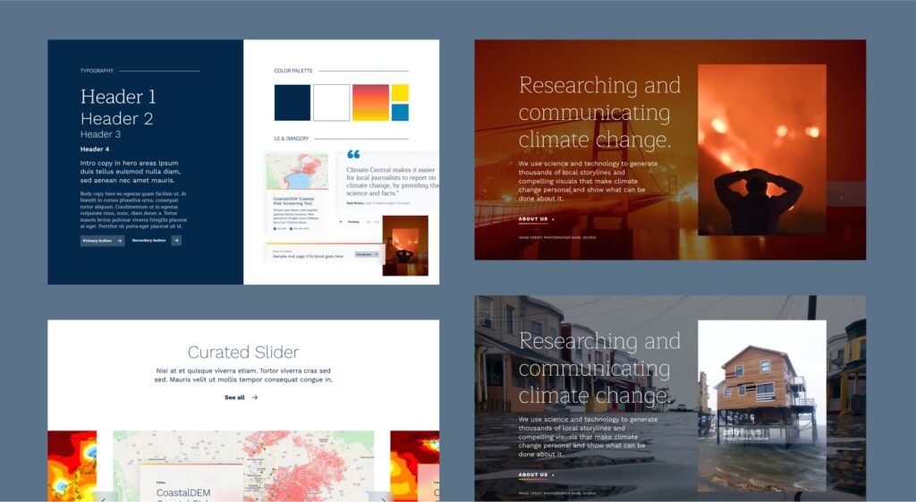
To support and complement this powerful imagery, we created a pared back and high-contrast visual system for the website. We landed on a fairly minimal, rule-based design system, using navy blue on white, as well as white on navy blue combinations, and a warming gradient to evoke a natural feeling in a less expected way.

This simple and high-contrast approach is highly-accessible, and makes it easy to separate sections, to feature large, white spaces, and to let the climate-forward images, content, and graphics shine.

Standardizing resources to improve the user experience.

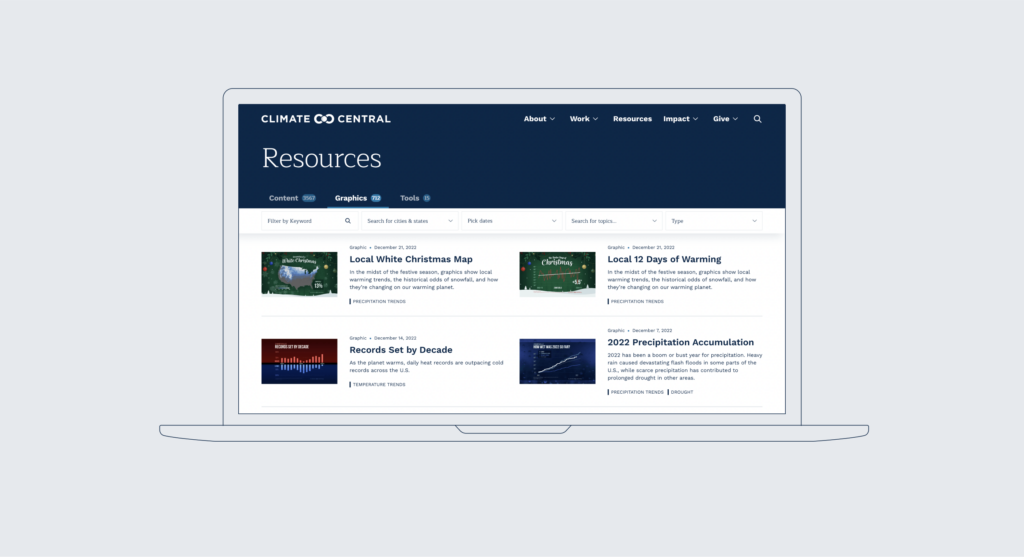
We spent a lot of time getting the resource library right, so that it could serve as a single source of truth. Previously, articles, published content, interactive tools for a newsroom, and even sub-organizations lived in different areas of the website.

With an organizational push to present everything as a resource, we worked to balance the different weights and offerings of each item. By creating a list view of all of Climate Central’s content, as well as topic clusters, and thoughtful taxonomies and filters, we were able to bring these different formats, across multiple paradigms, together under one house.

up next

Reimagining a brand for those who dare to dream of the stars

Karman
Reimagining a brand for those who dare to dream of the stars