Wings

Supporting adult survivors through trauma-informed design

A computer screen showing the Wings Foundation website

Understanding the needs of adult survivors.

Wings, a Colorado-based organization, is doing incredible, important, and nuanced work to break the cycle and heal the wounds of childhood sexual abuse by providing education, advocacy, and support to adult survivors, loved ones, providers, and communities.

We were honored to team up with Wings to develop a more inclusive, approachable brand identity and website. We aimed to support the organization in expanding their impact, and in removing some of the barriers adult survivors often face – such as stigma and access – to receiving support.

"We are so proud of and grateful for our collaboration with Radish Lab on Wings' brand refresh and website overhaul project. From day one, the Radishes approached this project with extreme care, compassion, creativity, and reverence for the needs of adult survivors of childhood sexual abuse.

They brought what is intrinsic in their DNA as a company to this effort, which fully aligned with all aspects of trauma informed care – and partnered with us to achieve a beautiful, resilient, impactful outcome. This project exceeded our expectations and sets Wings on a powerful trajectory going forward."

Wings Foundation

A brand focused on transformative healing.

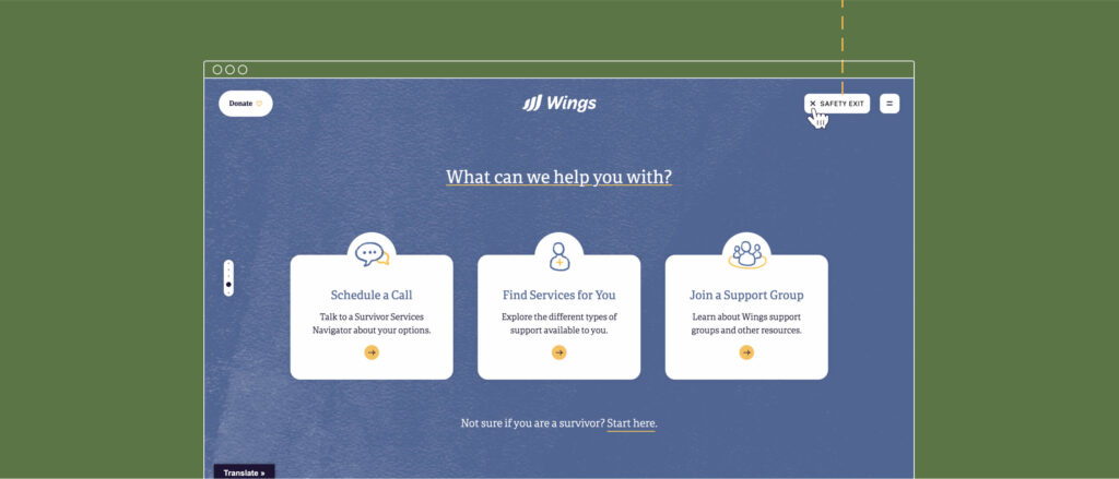
We needed to ensure that Wings’s new messaging and visual identity would be shaped by, and resonate with adult survivors, loved ones, and providers from all backgrounds and social positions. Through interviews, focus groups, and a survey with staff, stakeholders, and clients, we identified the unique attributes that help individuals feel safe and supported.

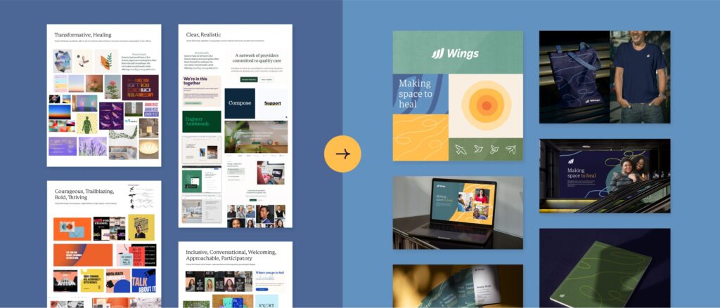
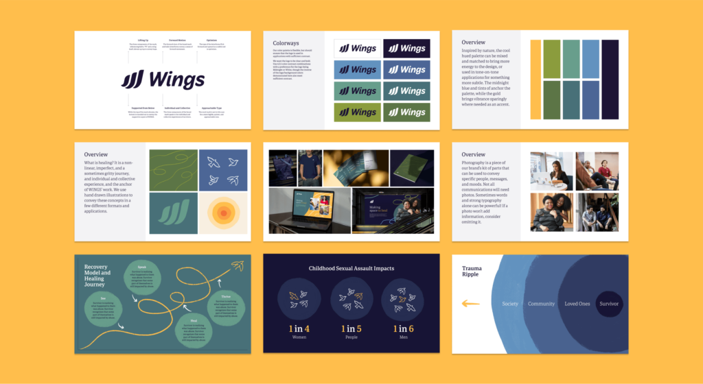
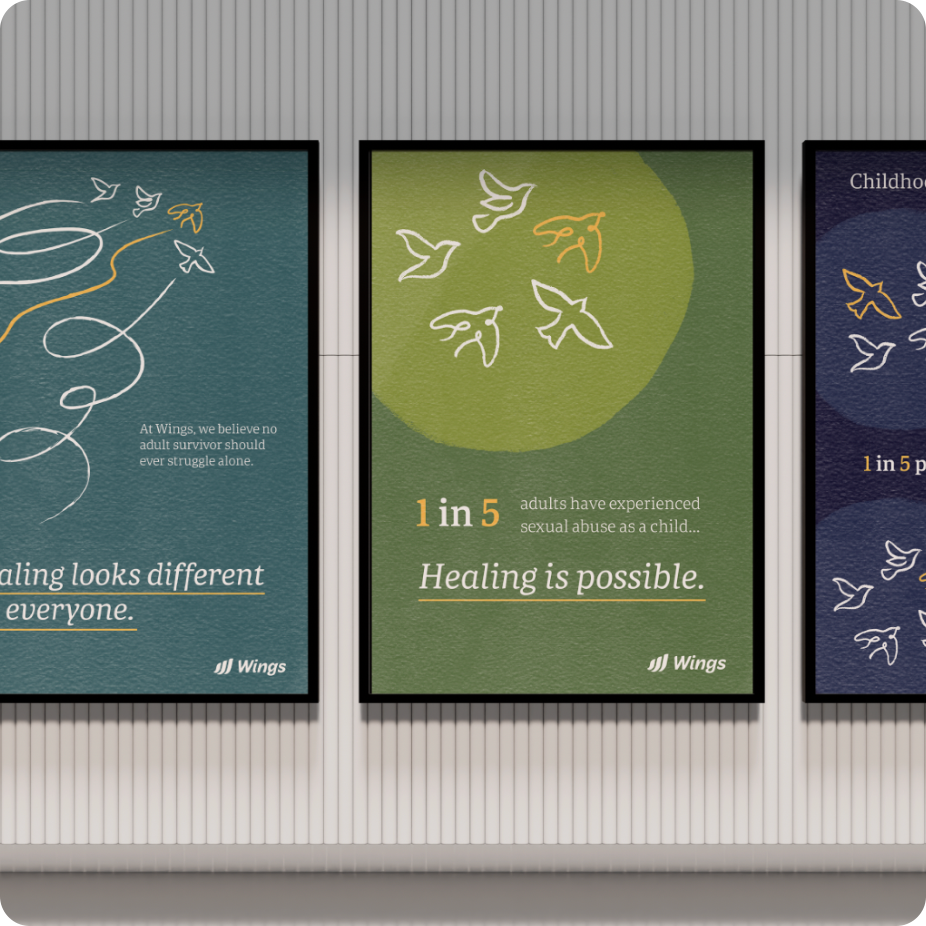
These values and qualities – courageous, grounded, compassionate, inclusive, and transformative – and the look and feel they evoke, served as the foundation for three distinct creative directions: Parts of a Whole, Brighter Horizons, and Murmurations, as well as for the colors, typography, and images that would become part of the new Wings brand.

After additional rounds of feedback, user testing, and internal refinement, we finalized Wings’s new logo and visual identity: informed by the needs of adult survivors, and inspired by their healing journey.

Bringing a trauma-informed approach to website design.

It was time to translate Wings’s new brand identity into a re-envisioned website for the organization. Taking a trauma-informed approach to design was critical, in order to create a digital space in which we hoped that adult survivors, loved ones, and providers would feel the sense of the support, safety, and agency that Wings would offer them in-person.

We made design choices to complement the thoughtfulness and intention of the content, including by: designing a slow, deliberate user experience; integrating the ability to opt-in to sensitive content, and to exit quickly if needed.

Collaboration.

The navigation unfurls a few items at a time, creating an experience more like a calming walk through a garden, than a drive down a super highway.

Choice.

A blur effect serves as a content warning over potentially triggering information, so that individuals can choose whether to explore that content.

Safety.

A safety exit – a link at the top of the page – allows the user to quickly close out and leave the website in case they find themselves at risk while viewing it.

We also included opportunities for users to quickly access coping resources and crisis support. It was important to highlight simple, accessible, and immediate actions that users could take in addition to the longer-term resources and support provided throughout the website.

Building a calm and inclusive space.

To help create a calming effect in the website’s design, we prioritized working with lots of white space and utilized green and natural tones throughout.

We designed the website to have a rich texture and a handmade feel. Using circles that are imperfect, underlines that are brush strokes, and backgrounds with a wall or leather texture, these elements communicate the impression of an organization that is human and welcoming, not too ‘cold’, ‘fancy’, or ‘corporate’, which could be off-putting.

Wings knows that adult survivors of childhood sexual abuse are incredibly diverse, and wanted to create a welcoming space for all. We were meticulous in picking photo representations of people of color, including indigenous populations, and also included consideration for body, age, and gender diversity.

Providing tools to approach and navigate the healing journey.

The website contains a robust and useful compilation of vetted resources for adult survivors. We worked on a taxonomy and resource center that would guide individuals to a variety of insights, including through a process of understanding how abuse shows up, as well as what factors to consider when disclosing their stories. A robust tagging system allows users to hone in on what they need, so that they can easily identify resources that will support them in their journey.

Supporting resilience and providing a pathway forward.

The final product seeks to support adult survivors, loved ones, and providers to approach the issue of childhood sexual abuse and gain vital information about it, as well as to inspire them to believe that hope and healing are possible and that there are steps they can take to move forward.

up next

Reimagining a brand for those who dare to dream of the stars

Karman
Reimagining a brand for those who dare to dream of the stars