Equimundo

Designing a new identity for a long-term partner

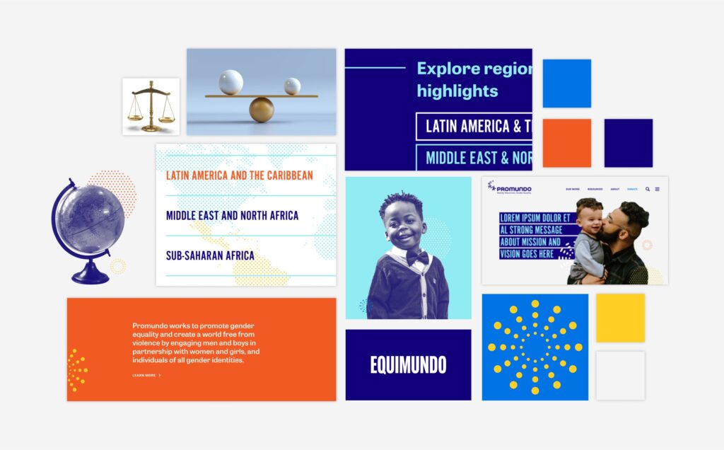
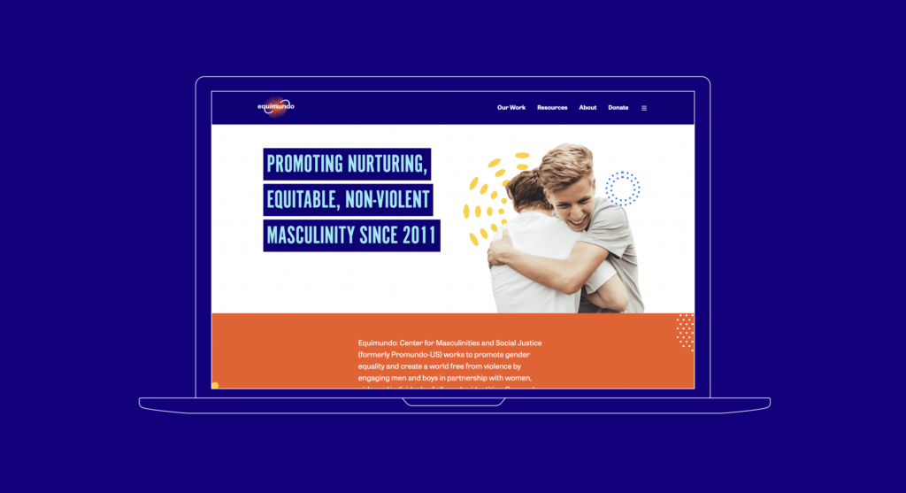
A collection of Equimundo website pages

Our partnership with Equimundo has spanned more than eight years, and most recently saw the organization take on their new name (previously named Promundo-US), and shift strategic directions: As an international organization, Equimundo promotes patterns of care, empathy, and accountability among boys and men throughout their lives.

We were excited to be thought-partners in supporting the organization as they stepped into their new identity. We designed a new logo, and brand visual identity for the organization, in tandem with creating a fully redesigned website.

"We have had the pleasure of working with Radish Lab for several years now, and they have become a trusted partner and close collaborator of ours. They guided our rebrand process with creativity and have consistently exceeded our expectations with their high-quality work.

The Radish team demonstrates a deep understanding and dedication to our mission and goals, which shines through in the products they create for us. They are an invaluable partner in our work."

Equimundo

Gathering data, to inform the organization’s new, external face.

To complement Equimundo’s new name, they needed a logo that would represent the core of the organization’s work and values: representing their focus on gender and equality, as well as their global impact. The logo needed to be comparable to similar organizations, while also being distinctive, memorable, and clear.

Through a brand audit, and qualitative research with the organization, we identified attributes that would frame our logo design: it should feel international, cross-cultural, human-centered, bold, and clear.

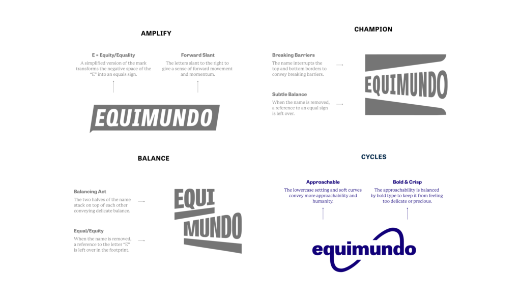
With all of our research, and design inspiration in hand, we began exploring four different concepts, each emphasizing a crucial part of Equimundo’s work. These concepts were named: Amplify, Champion, Balance, and Cycles:
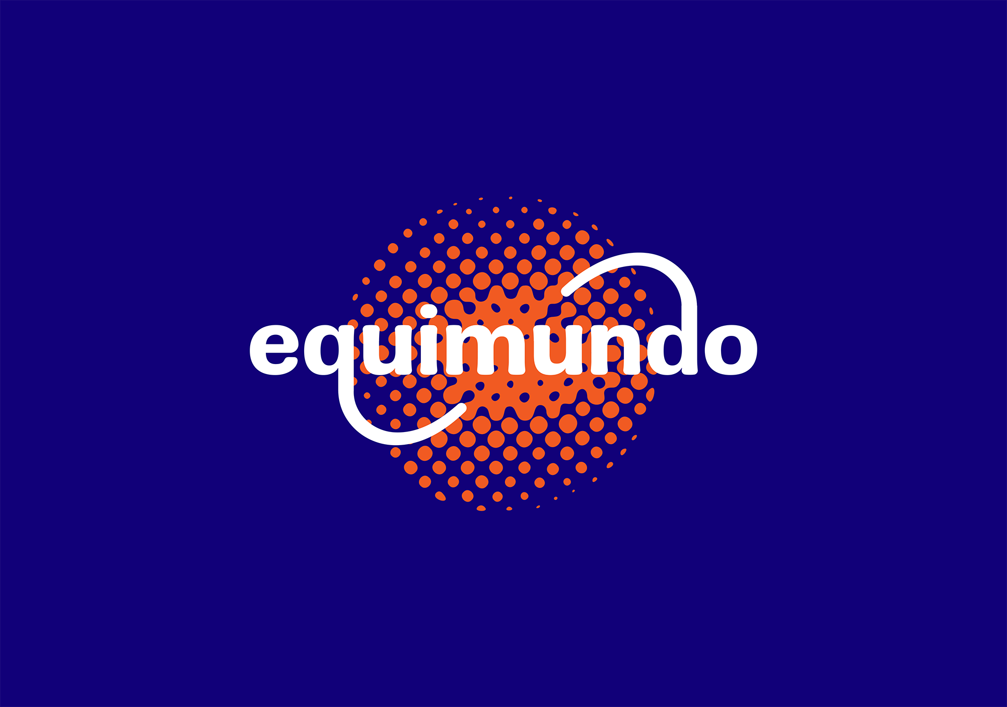
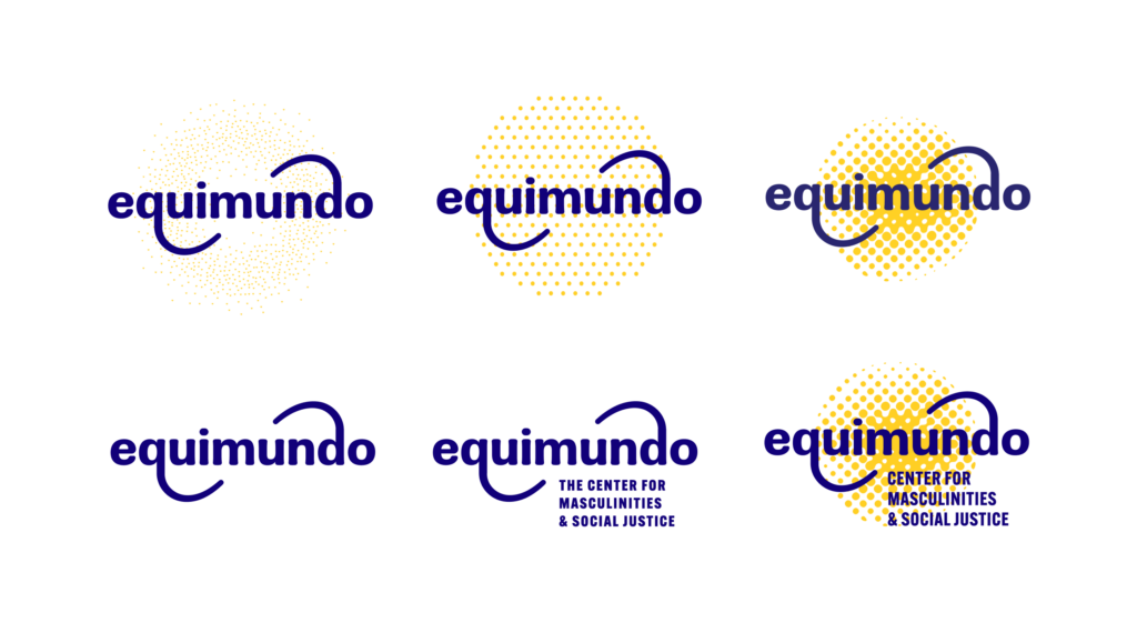
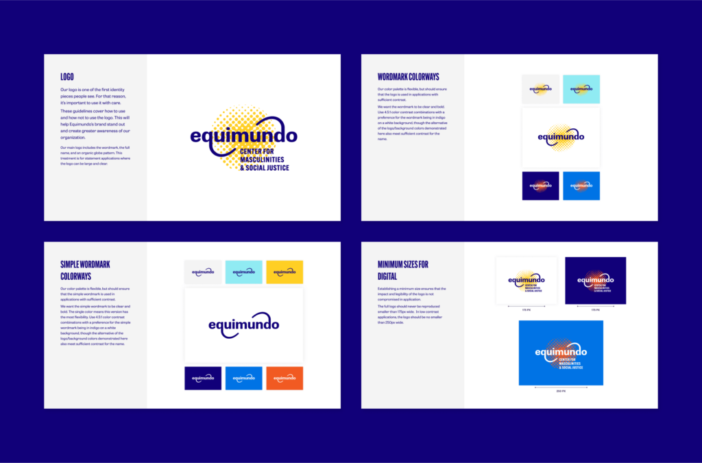
After careful consideration, Equimundo moved forward with the Cycles concept. To add emphasis, and to convey a greater sense of celebration, interconnectedness, and a global feel, we added a dispersed, dot patterned treatment to the typeset.

Aligning a new strategy, to a digital space.

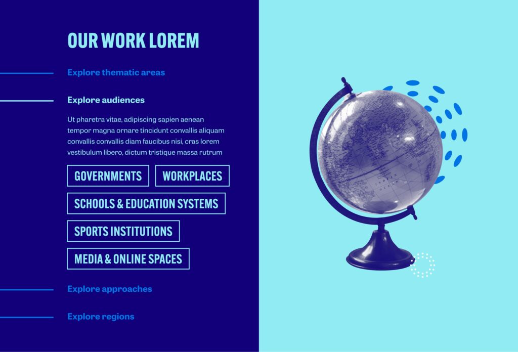
Equimundo’s strategic planning process supported them to rethink their thematic areas, audiences, and approaches. In designing their new website, we wanted to help translate the organization's strategic plan to a wider audience by creating a simplified navigation, alongside a more sophisticated taxonomy and tagging system.

Rethinking the information architecture, we ensured that a user would be able to arrive at the same end, through a variety of entry points. For example – if a user is looking for a particular program, they can now navigate there through the thematic area of focus, a particular audience, an approach, or even the region where the work takes place. This created an interconnected content network that meets users where they are at, and can help guide them along a journey.

Balancing joy, and optimism to topics of weight.

While the organization’s work is quite serious – and often touches on issues of violence, inequality, and social injustice, it felt important to instill a sense of positive forward movement and optimism when it came to how the website would look and feel.

To accomplish this, we used saturated warm and cool tones, balanced with deep blue, white, and light gray. We also juxtaposed bold and condensed header statements with legible, airy body copy. And, we layered in celebratory and multidimensional imagery using duotone, halftones, and bursts.

up next

Reimagining a brand for those who dare to dream of the stars

Karman