The International Holocaust Remembrance Alliance (the IHRA)

Branding to elevate a powerful message

Balancing a new visual identity with a rich organizational history

The International Holocaust Remembrance Alliance (the IHRA) – our long-term partner – wanted a fresh, forward-looking visual identity that could integrate with their logo and nod to the organization’s deep history. Their current identity wasn’t working for the IHRA – they didn’t have enough colors, flexibility, or design elements to create a rich, sustainable design system.

The IHRA's message is powerful. Our challenge was to create a new identity that supported it. Designing visuals that would align with content around Holocaust remembrance required a high degree of sensitivity, caution, and consideration.

Radish Lab’s research-led approach to refreshing our visual identity made all the difference and meant that this process could impact much more than our brand visuals. It has truly been transformative.

Barbara Uchdorf,
Interim Head of Communications

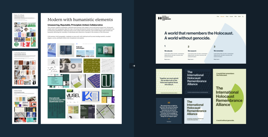
Bringing impact into focus through design research

Building on the brand attributes we developed for the team – Unwavering, Reputable, Principled, United, Collaborative – our design research focused us in on three critical aspects of their impact: The importance of centering Holocaust remembrance; the diversity of the people, organizations, and nations united by the IHRA; and the deep knowledge and expertise of the network.

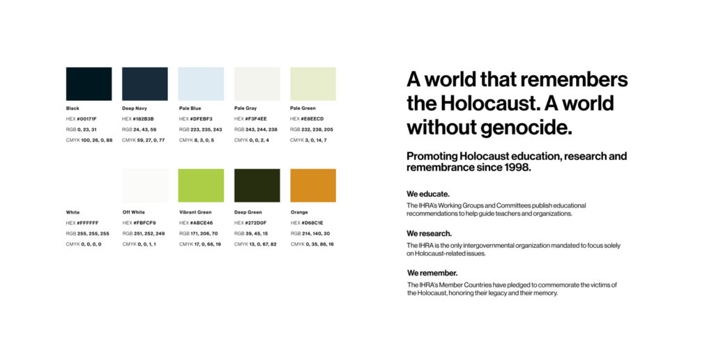
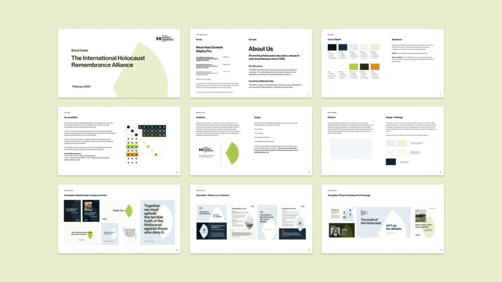
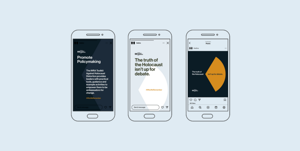
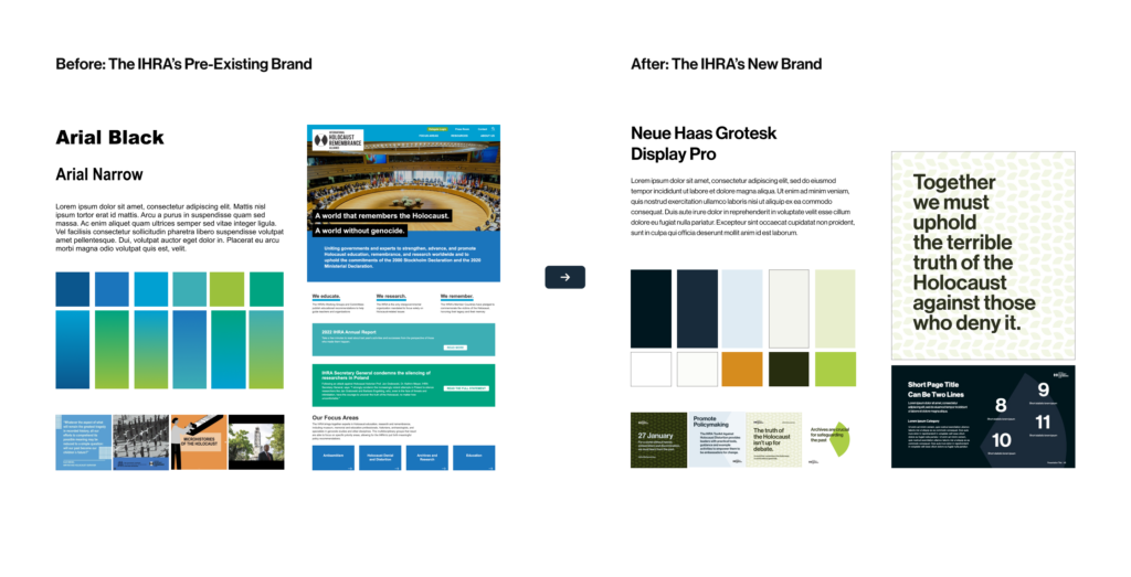
We wanted to develop a simple, clean, and connected visual identity. When it came to color, graphics, categorization, and even patterns, we needed to pay very close attention to what influences we channeled and how any of the abstractions could be interpreted.

After consultation, we moved toward a concept that combines a minimalist, utilitarian grid system with organic curves. Strong and simple sans serif typography takes the lead to clearly convey information and evoke the IHRA’s authoritative role in Holocaust remembrance.

Rounded shapes add warmth and humanity, affirming the centrality of individuals – and of the collective experience – to the memory of the Holocaust.

A beautiful brand, within a sustainable design system

The IHRA saw the value in having a stronger visual language. We struck a fine balance between soft and approachable with a quiet strength, and created shapes informed by negative space in the logo.

Sometimes, when a brand includes a minimal palette, bold geometric type, and color blocking, it can feel hard or aggressive. We worked diligently to use these elements to evoke something more nuanced and versatile. We designed the palette to balance various feelings: solemnity, sophistication, optimism – that would be both forward-looking (prevention of future atrocities) and retrospective (remembrance).

Guidance to implement with confidence

In addition to beautiful design, we made sure the visual identity would work in the long-term: be accessible for the web and flexible enough to be applied across all of their assets. We not only wanted to create thoughtful work, but to deliver strong, easy-to-follow guidelines and templates that made sense.

We got to really test the limits of the brand, find where the playspaces and guardrails exist, and then document it, to create a robust, cohesive set of assets so that the IHRA team could feel confident implementing the branding moving forward.

up next

Reimagining a brand for those who dare to dream of the stars

Karman