Skip to content

Boston Athletic Association

The Boston Marathon and much more

The Boston Athletic Association has been at the heart of American running culture since 1887.

They’re the stewards of the Boston Marathon, the world’s oldest annual marathon and a bucket-list goal for runners everywhere. But BAA is more than a single race. They organize seven major events each year, run community programming across Greater Boston, and have raised millions for charity. Their mission is simple: help people experience the joy of running.

Their website wasn’t telling that story.

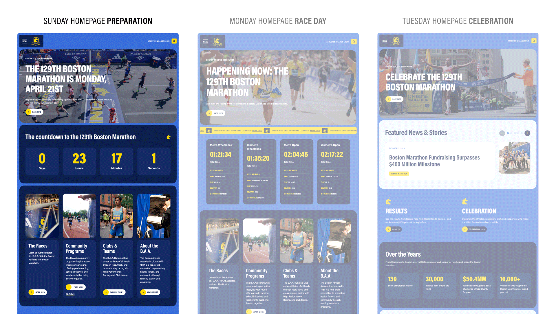
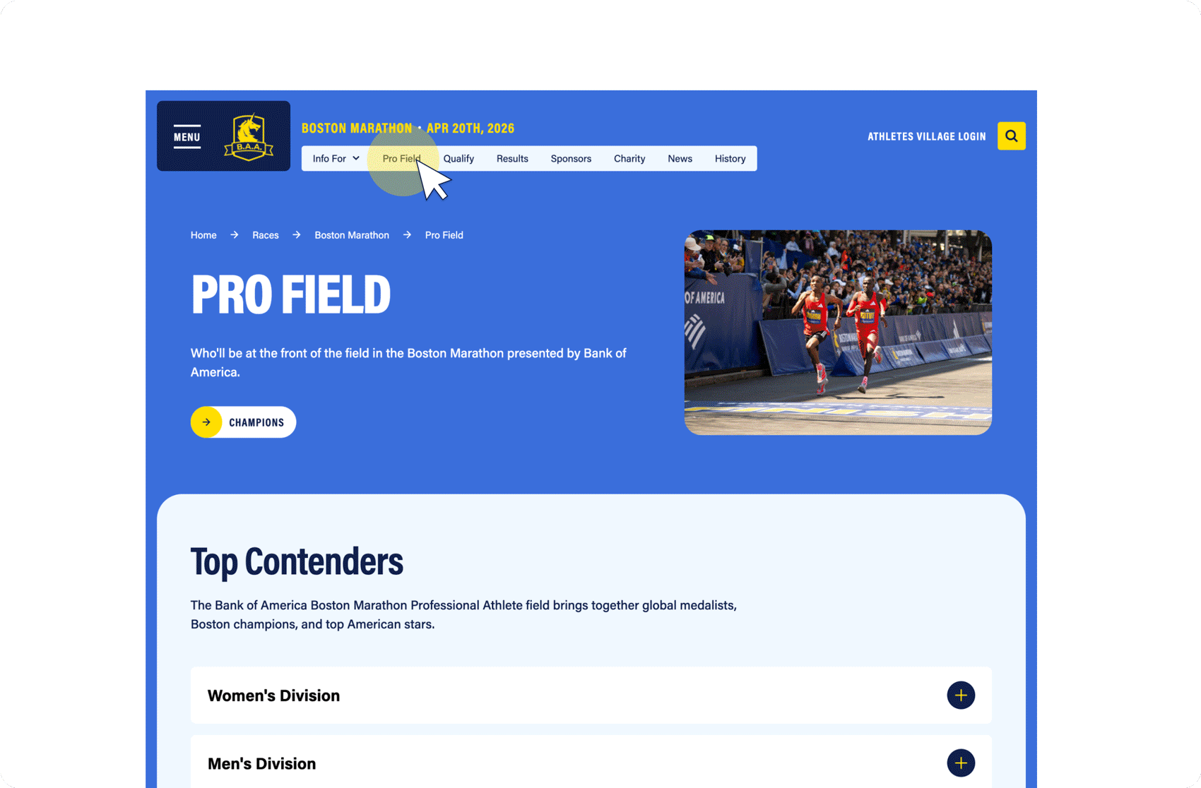
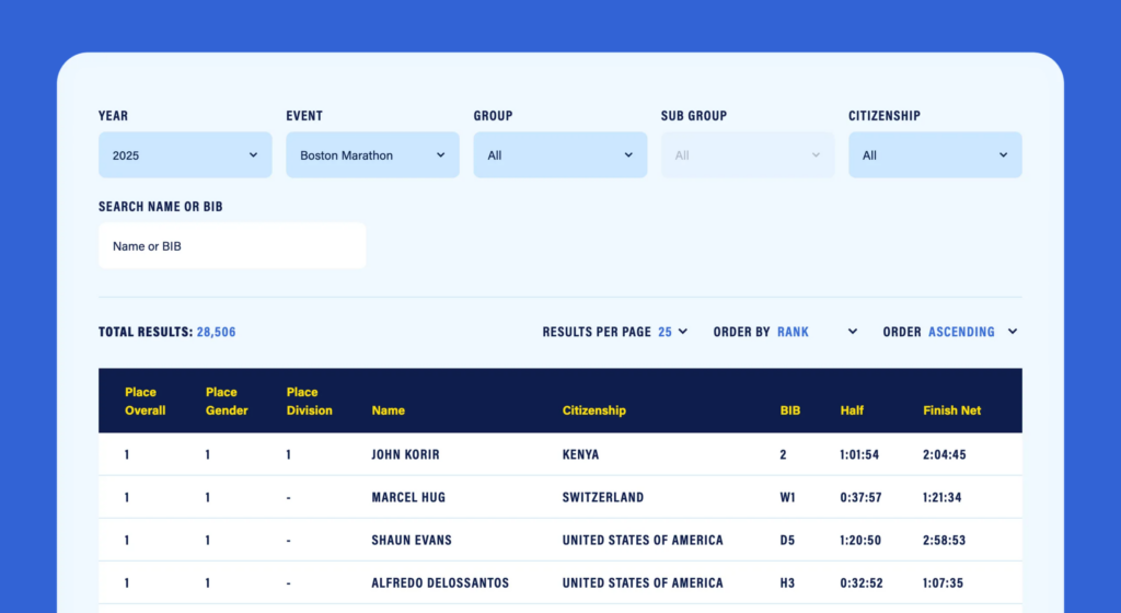
Information lived across multiple platforms: the Athletes’ Village (behind a login), a third-party FAQ tool, scattered PDF documents, and the website itself. Runners preparing for race day had to hunt across all of them. 24 years of race results were spread across different vendor sites, each with its own interface. And with over 60% of visitors on mobile, the experience fell short of the world-class standard BAA sets for everything else they do.

The challenge wasn’t attracting runners. The Boston Marathon always has a waitlist. The challenge was creating a digital experience that matched the prestige of the event itself.

+32%

mobile engagement rate

+36%

mobile session duration

+17%

engagement rate across all devices

A mobile experience built for how runners browse

With 61% of BAA’s audience on mobile, the redesign prioritized that experience. Mobile engagement rate jumped 32%, and average session duration increased 36%. The gap between mobile and desktop engagement narrowed from 19 percent to just 4.

Preparation, Race Day, Celebration

A running site doesn’t sit still. In the weeks before a race, the homepage is about logistics: registration, qualifying, training resources. On race day, it’s about live tracking, road closures, and spectator info. After the finish, it’s about results, photos, and celebration. The new BAA.org is built to transform through these phases. Staff can shift the homepage and race pages from to adapt from “preparation mode” to “race day mode” to “celebration mode” quickly, without developer support. A modular system designed for a site that changes as often as the events it supports.

Elevating the BAA brand for the screen

BAA’s visual identity is iconic, the blue-and-yellow of the Boston Marathon is recognized worldwide. But a brand built for finish lines needed room to breathe across a complex digital experience. We expanded the color palette to soften the intensity for everyday browsing, introduced typography that works harder for the dense informational content runners depend on, and developed bib-inspired layout components that give each page a dynamic, modular feel. The result is a site that’s unmistakably BAA, but built for the screen and not the racecourse.

Seven races, each with a homepage of its own

BAA doesn’t run one event. They run seven. From the Marathon to the 5K to the Invitational Mile, each race has its own audience, schedule, and personality. The new site gives every race a dedicated experience that feels like its own homepage, with distinct visual identity within the BAA system. A runner checking in on the Half Marathon doesn’t feel like they’ve landed on a subsection, they feel like they’ve arrived.

Navigation built for a site this complex

A site that’s essentially eight destinations in one needs navigation that doesn’t overwhelm. We designed two layers: an organization-wide menu (tucked behind a hamburger, opening down the left side) and a race-specific navigation across the top of each race page. That race-level nav keeps the event name large and prominent, reinforcing the homepage feeling. Runners stay oriented within their race. Visitors exploring the broader organization can always get there.

Working with Radish was a great collaboration. They got us as a brand and organization, and helped us reach where we wanted to be with our new site, while making the process fun and truly collaborative. Great experience.

Alex Marse, Senior Manager, Brand & Creative Direction, Boston Athletic Association

Everything a participant needs, in one place

The old site had critical race information spread across the website, a third-party knowledge base, PDFs, and emails. The new BAA.org consolidates everything into dedicated “Info For” pages — for athletes, volunteers, and spectators — organized by phase: how to qualify, how to register, how to prepare, what to expect on race day. No more hunting. One destination, from qualifying standards to start line logistics.

24 years of race results, unified

The new Race Results tool brings decades of finish times into a single, searchable experience. It’s vendor-agnostic by design. BAA can upload results from any timing partner, and runners get a consistent interface whether they’re looking up a 2024 finish or a 2001 personal best. In the first 81 days after launch, runners searched results over 136,000 times.

Let’s Talk

We’re always excited to connect with potential clients, partners and people – whether you have an active RFP, are looking for a new vendor, or just want to learn more about what makes Radish Radish.