
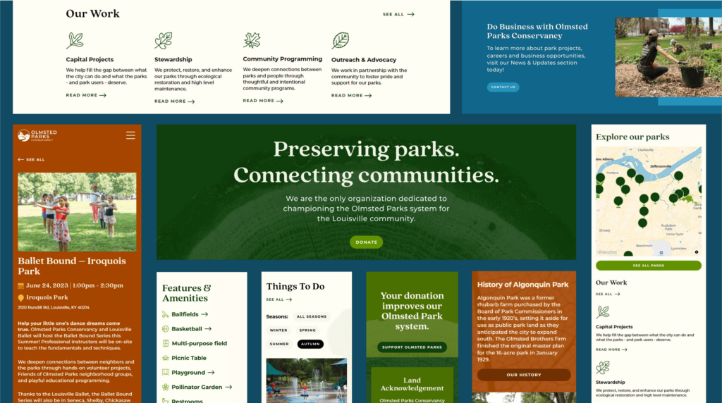
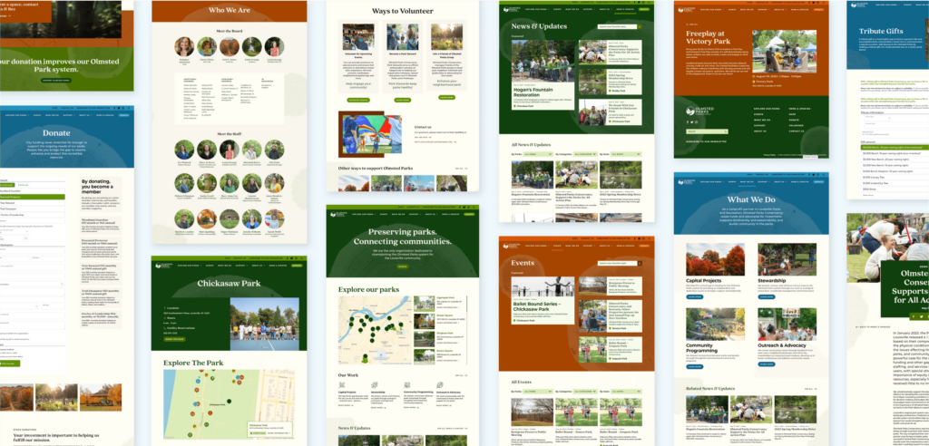
Olmsted Parks Conservancy
A virtual walk in the park
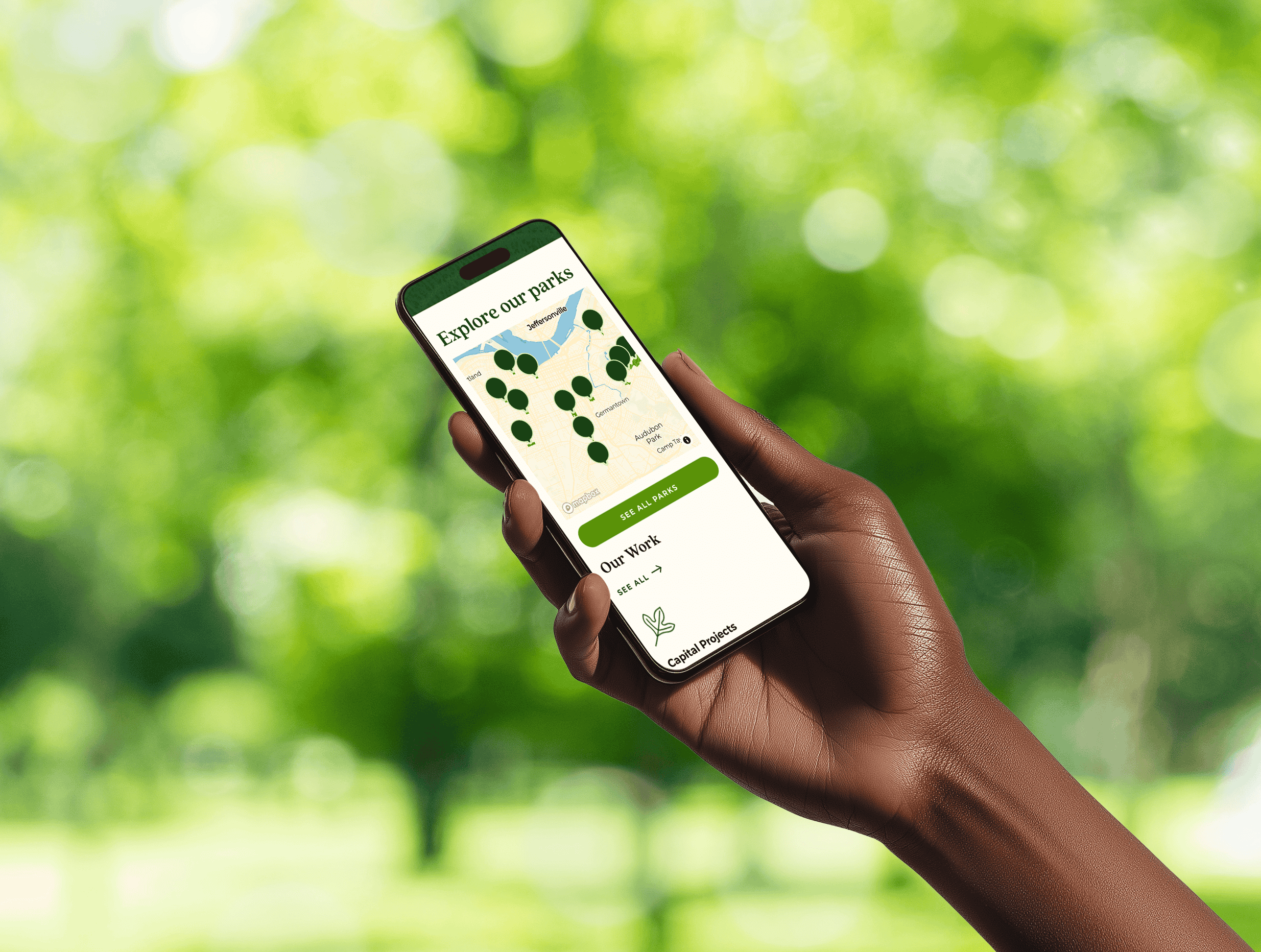
Enhancing parks through a community-centered website.
The Olmsted Parks Conservancy (OPC) makes Olmsted-designed parks and parkways even better by preserving and safeguarding them. They bring nature and the community closer together and promote the well-being of residents. With the parks system growing, public interest rising, and substantial investment in new offerings, OPC needed their website to align with their goals, stay true to their values, and support their vision.
We set out to create a website that would prioritize the community, promote sustainability, and center accessibility. Our goal was to build a dynamic online platform that could serve as a hub for events, activities, and volunteer opportunities. We wanted to create a space where all park users could come to get informed and stay engaged.
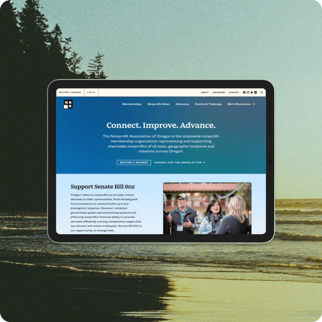
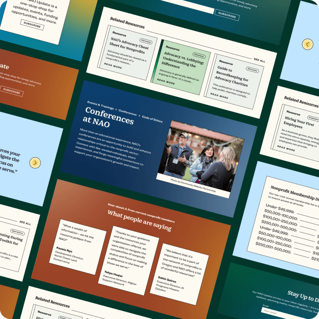
The Nonprofit Association of Oregon
Building a Digital Hub for Oregon's Nonprofits
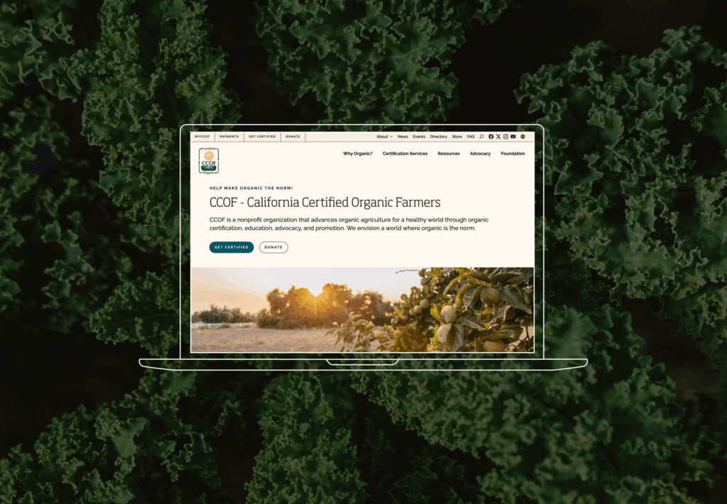
California Certified Organic Farmers
Designing Clarity Out of Complexity
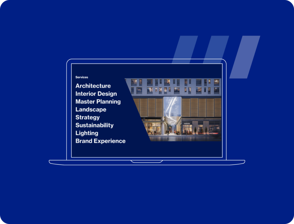
HLW Architecture
Building a dynamic portfolio site for a global architecture firm
Let’s Talk
We’re always excited to connect with potential clients, partners and people – whether you have an active RFP, are looking for a new vendor, or just want to learn more about what makes Radish Radish.