The Clinton Foundation

Creating a new digital home for a world-class philanthropy and presidential center

Bill Clinton greeting onlookers

Conveying a lifetime of service.

The Clinton Foundation came to us with some tough questions: How could their website capture President Clinton’s lifetime of public service, and bring clarity to the impact of the many different arms of the Foundation’s work? We knew we needed to approach this complex, highly-visible project with nuance and precision.

We met up in Little Rock, AR, the home of the Clinton Presidential Library and Museum, to kick off this project. Through interviews and focus groups, we gathered insights from high-level stakeholders, including the Executive Director and CEO of the Foundation, along with multiple members of the Foundation’s Senior Leadership team. With a clear sense of everyone’s needs, we began to create a vision for how the Foundation’s audiences could connect with and explore their work and impact online.

Radish Lab has been a trusted partner in helping us reimagine a new digital home and approach for engaging our partners and audiences in the story of the Foundation’s work and impact.

The Clinton Foundation

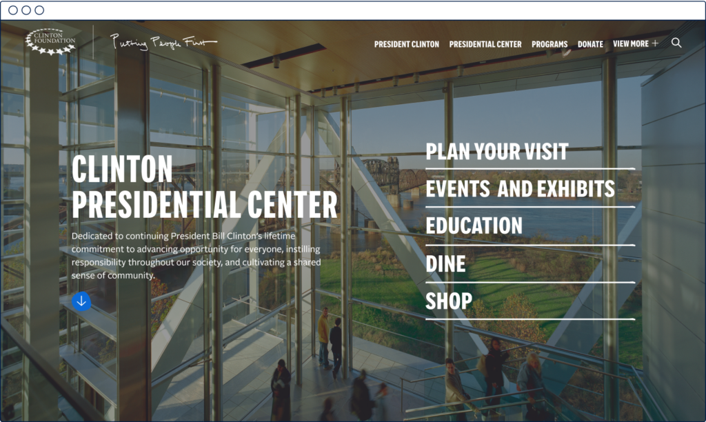
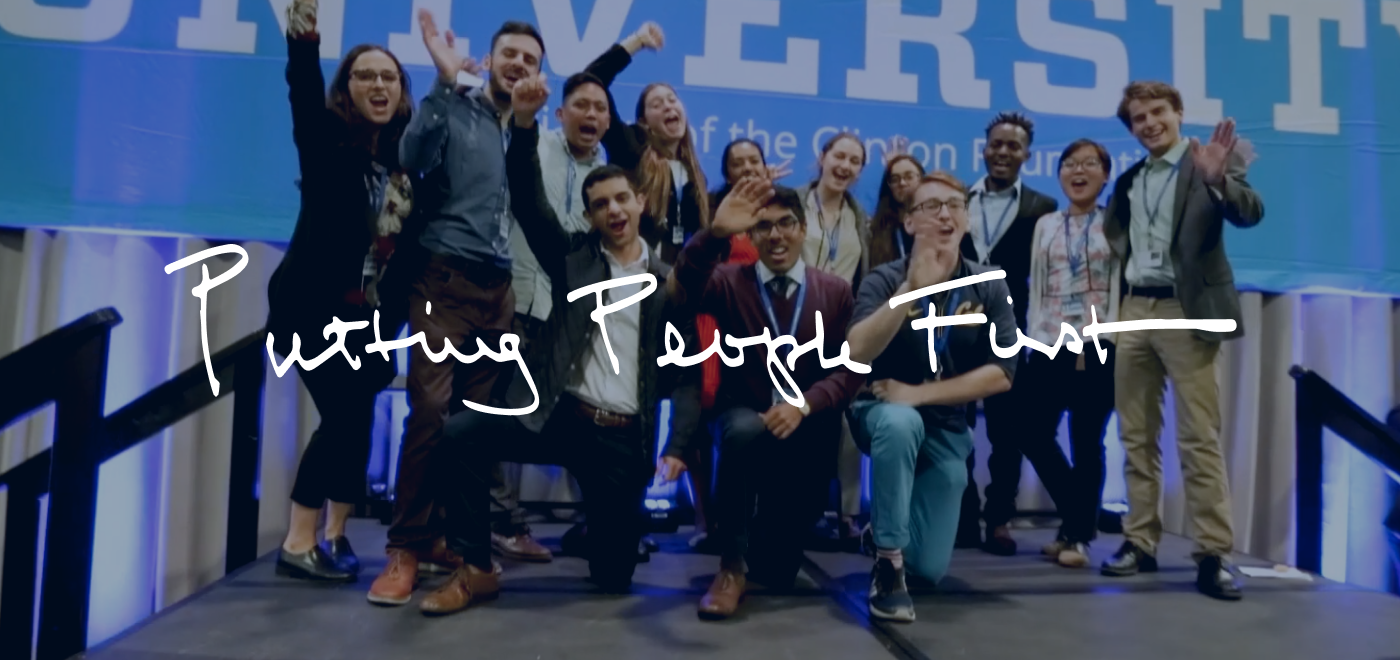
Putting people first in the Clinton Foundation’s story.

The Clinton Foundation excels in identifying tough problems, and in bringing people together to help solve global issues, from climate change to the opioid crisis. The President holds a deep commitment to the well-being of people in the U.S. and around the world and a belief that diverse groups of people make the best decisions.

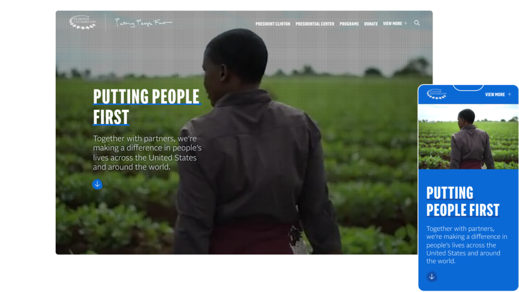
Given the clear and resonant ethos, “Putting People First,” we determined that this mission and tagline would be front-and-center to the website, and serve as the users’ first invitation to explore more deeply. We used the signature handwriting and inky lines for a personal touch at different scales to create dynamic textures.

Connecting digital audiences with the Foundation's work.

We wanted to build a cohesive story for the Foundation that moved beyond each individual program. We needed some connective tissue to help the audience understand exactly what the Clinton Foundation focuses on, in specific terms, but also didn’t want to overwhelm users with the details.

We undertook a collaborative process to consolidate and rename the Foundation’s areas of thematic impact for digital audiences. This process helped us to better organize the existing programs and to drive the site’s search engine optimization (SEO) value by clustering content into the following areas:

Leadership and Public Service

Education and Health Equity

Climate Change and Disaster Recovery

Economic Inclusion and Development

Designing a mega menu for more choices, and more clarity.

The Foundation’s previous website had made it challenging, even for those familiar with the work, to find what they were looking for: from a resource, to an event registration form, or information about a specific program. There was a lot of content to work with across the Foundation’s programs and arms, which provided a challenge and an opportunity for reenvisioning the information architecture and sitemap.

To make the navigation experience easier and more straightforward, we stripped back the content we had to work with, removing outdated pages like old program pages and blog posts. Then, we developed a robust, interactive mega menu with a clear, consistent structure to allow users to more quickly and intuitively find what they are looking for.

    Infusing approachability into design.

    From a design perspective, we challenged ourselves to translate the idea of “putting people first” into compelling visuals, as well as to infuse warmth and approachability into the color palette and design.

    To accomplish this, we introduced custom-designed assets throughout the website, including: personalized, handwritten elements; vibrant photos and video reels of the Clintons visiting Foundation partners and programs; soft transitions and animations; and icons that balance organic shapes and crisp line work.

    Integrating an accessible user experience.

    Another important part of the work was figuring out how to make a more intuitive user experience for the Clinton Foundation’s key audiences.

    We needed to build the website in a way that was tailored to the Clinton Foundation’s audiences. We took particular care to ensure that the website would meet WCAG AA Accessibility standards. We undertook a thorough audit and development process, with particular consideration for font sizing, color contrast, and accessibility of interactions.

    Building a dynamic, and flexible structure.

    Finally, we wanted to help the Foundation’s website users to dig into the programmatic content in an engaging and dynamic way. We built a tailored microsite for each program area, drawing connections among them to ensure that each page would be interactive and unique.

    To ensure that the full website experience could be maintained and expanded upon post-launch, we built in maximum flexibility through a robust module library, which will allow their team members to continue to spin up custom, designed pages as the site evolves.

    up next

    Ending pandemics through strategic partnerships

    (RED)
    Designing to fight the world’s biggest health emergencies