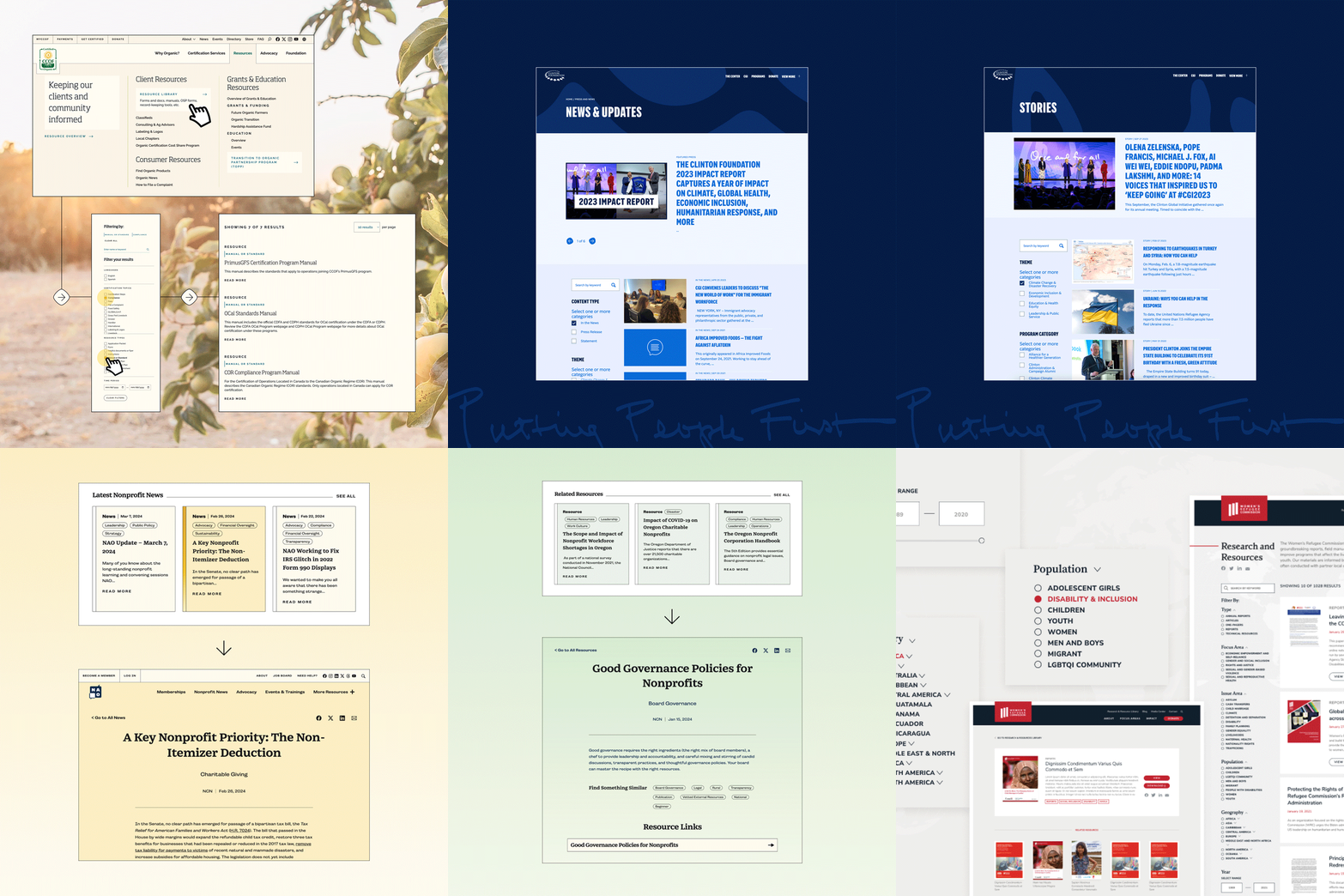
Blogs, stories, research, videos, podcasts—the list of content nonprofits create is endless. But as your organization grows, managing that content can feel like wrangling a runaway train. Without the right system in place, your best resources can get buried, and your audience is left digging through a messy site.
That’s where Radish Lab comes in. We make sure your users find exactly what they need—and discover the gems they didn’t even know to look for. We’re experts at designing resource libraries that are easy to use, beautifully organized, and fun to explore. Our approach to user experience (UX) and strategy doesn’t just clean up your content—it empowers you to make smart choices early on, transforming your content into a powerful tool that drives engagement, surfaces relevant information throughout your site, and boosts your SEO.
Learn more about how we approach Resource Libraries and check out a few of our favorite examples below:
Tackling a Volume Problem
California Certified Organic Farmers
Web Design and Development | Environment
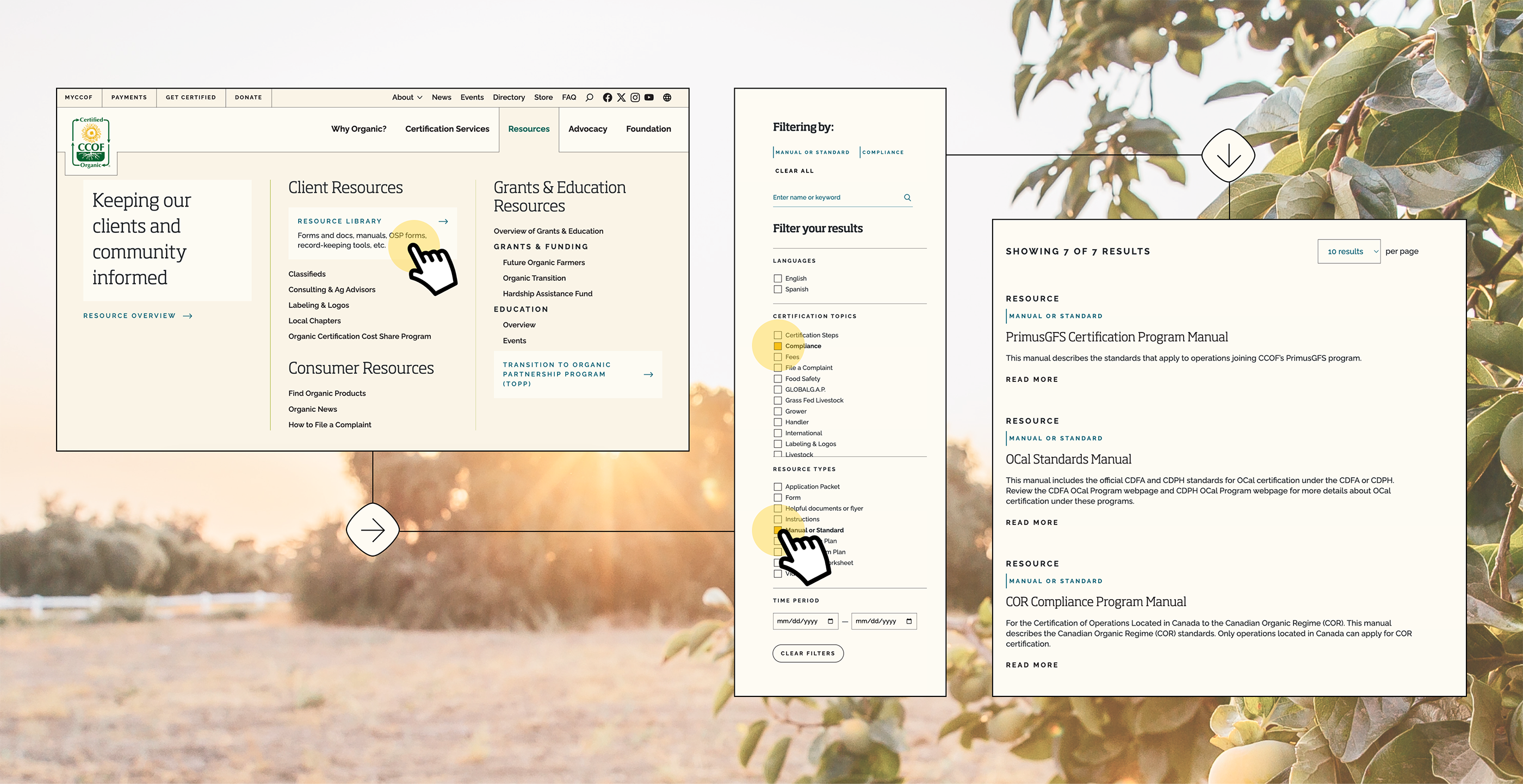
One of the first things we do with any new client is dive deep into their existing site. We map URLs, crunch analytics, and sometimes uncover some surprises. CCOF’s site was a perfect example. They knew their website had a lot of content, but didn’t realize it was over 11,400 pages. During discovery interviews we learned users were even using Google to find resources rather than attempt to find them directly on the CCOF website itself because the site’s structure was so overwhelming.
We rolled up our sleeves and went to work. By restructuring their content types and implementing a smart taxonomy system, we made the CCOF site easy to navigate. Now, users can quickly and easily find the resources they need. Plus, stay tuned—we’re cooking up something new to supercharge their Member Directory!
Now, we’re working with CCOF to enhance their Member Directory experience. Subscribe to our newsletter and follow along on social.
Case Study | Resource Library and Directory
Organized Content for Members and Non-Members Alike
Nonprofit Association of Oregon
Web Design and Development | Philanthropy
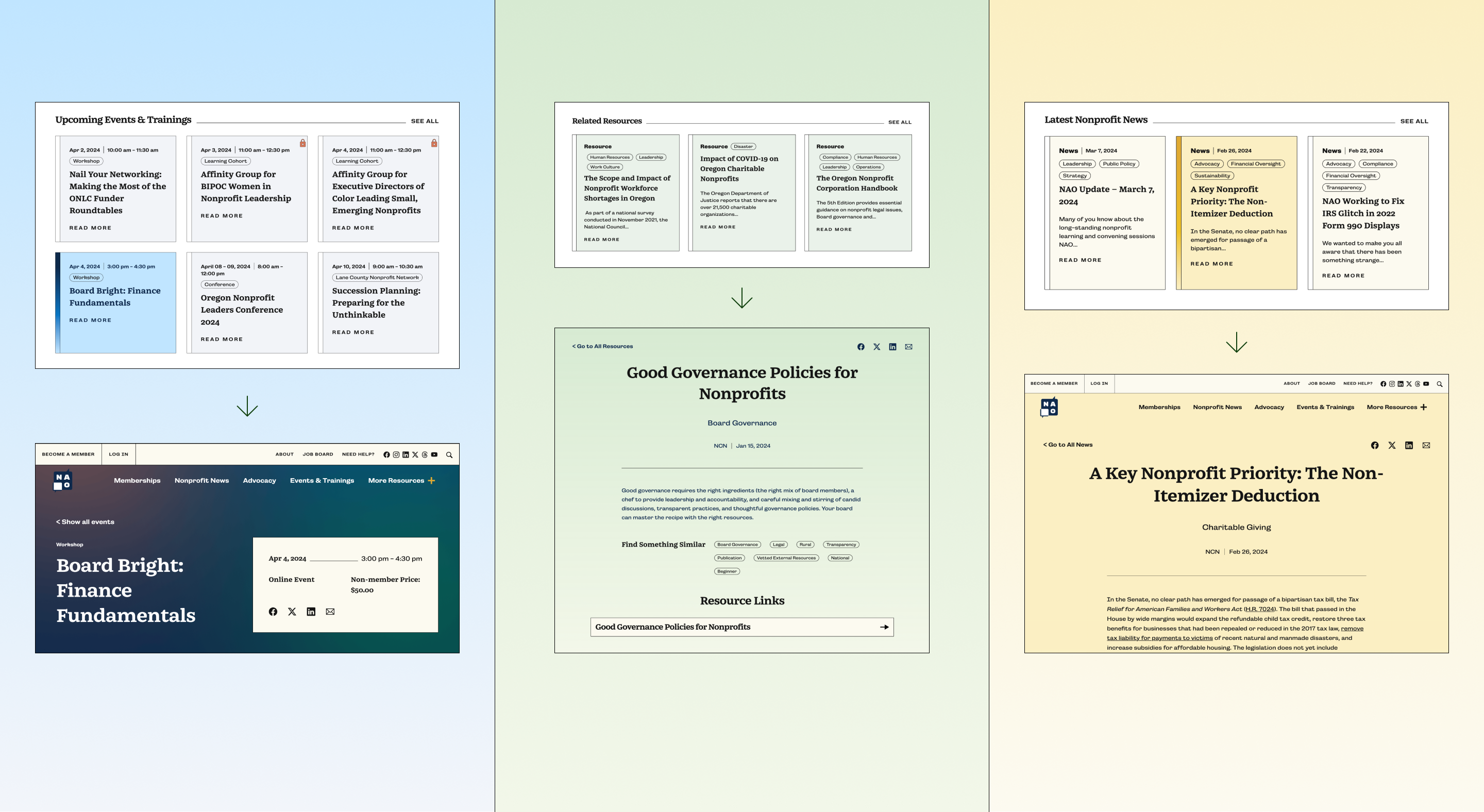
A huge offering that The Nonprofit Association of Oregon provides to members and non-members alike has always been their resources. Their resources span a wide range of types from fact sheets and publications to reports and case studies to guides and curated external resources; their database is a robust space for everyone in the nonprofit community. Their old site struggled to showcase the breadth of resources available in a user-friendly way, making them nested and hard to find. Building one central resource library allowed NAO to clearly showcase their open source and member-only content side by side to help retain and drive new membership. And with new and improved taxonomies, incorporating featured and related resources site wide became an easy way to leverage their library throughout the experience.
Case Study | A One-Stop-Shop for Resources
Reworking Decades of Content Into One Robust Library
Women’s Refugee Commission
Web Design and Development | Human Rights
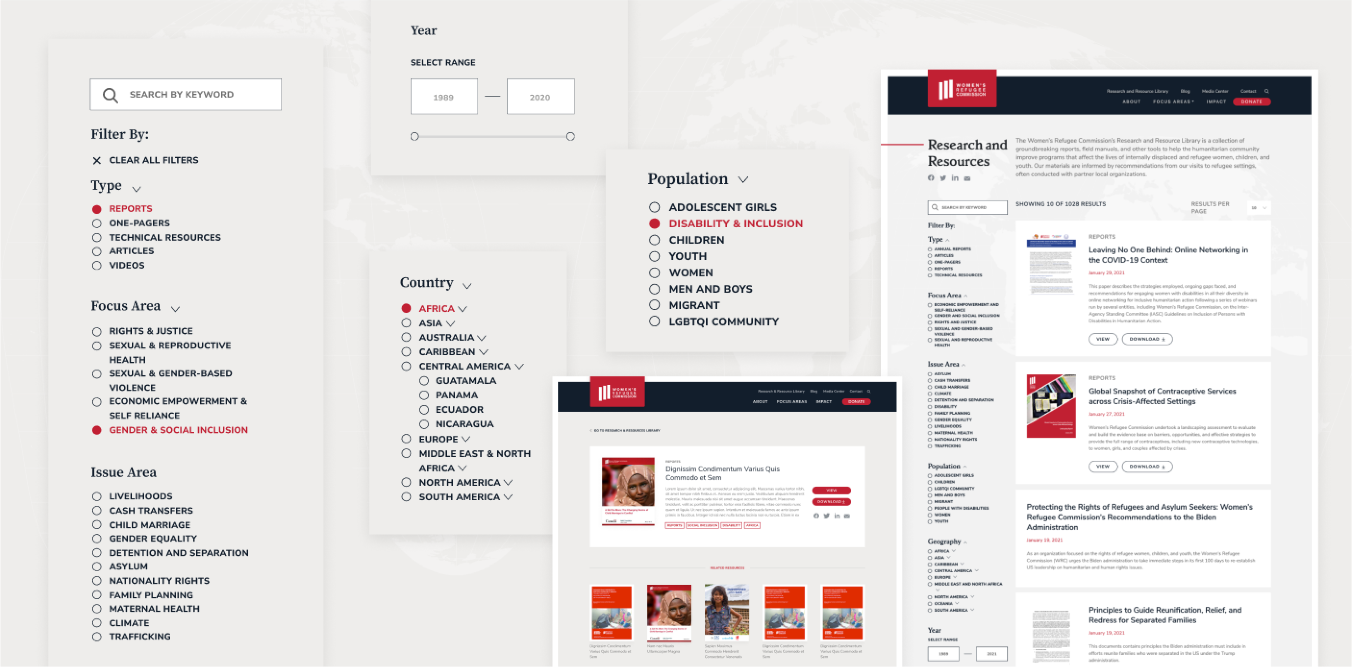
The Women’s Refugee Commission (WRC) had decades of materials when they first began working with Radish to overhaul their website. Their content came in many different formats spanning all of their focus and issue areas. That made it imperative to be thoughtful about a new taxonomy system that would allow users the most flexibility when searching and filtering to find something specific, while making sure that the system was tight and sustainable for the WRC team to manage. The end result is an intuitive experience that allows users to search, sort and filter by resource type, focus area, issue area, country, population and year – providing users with a robust set of options to navigate through the incredible content housed in the WRC website.
Case Study | Explore for Yourself
Stories, Videos, Podcasts, News and More
Clinton Foundation
Web Design and Development | Public Health, Environment
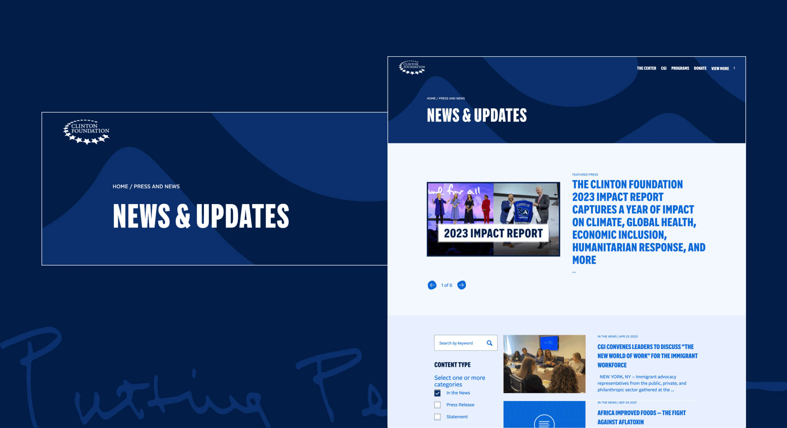
The Clinton Foundation had a unique challenge when entering into the collaboration with Radish Lab: their website needed to house effectively three separate experiences: The Clinton Foundation’s work, stories, resources and programs; President Clinton’s Presidential Center exhibitions, visitor information, and shop; and the Clinton Global Initiative’s event information and CGI specific content. (Read more about how we solve for Multisite problems with our clients on our recent blog). The information architecture solution for this stems from the use of the mega navigation, where each vertical is clearly defined with their own sections of the main experience. For their resource library, we took a similar approach with separate hubs for the distinctly different content types housed throughout the full website: Stories, Audio + Visual Content, and News & Press. Each content types’ listing page allows users to search and filter by unique topics, taxonomies and media types to bring the best match resources to the users quickly and with ease.
Now we’re revamping their content library with a multi-media focus. For the latest on our collaboration with the Clinton team, subscribe to our newsletter and follow along on social.
Case Study | Read Clinton Stories, Watch and Listen to Content or Explore News and Press
Explore it Both Ways: One Big Hub or Content Specific
TNTP
Web Design and Development | Education
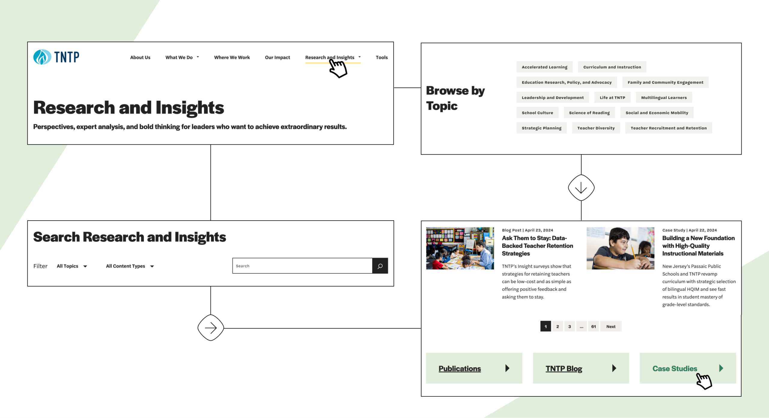
TNTP came to Radish with a large library of content and resources produced by their team, ranging from blogs to case studies to research publications. A key priority of the work with Radish was to make sure that all of their content was more accessible, searchable and usable. During the User Experience portion of the process, we worked with them to identify what taxonomies and topics were most important for users to be able to explore their work through. The end result culminated in a Research and Insights Hub that housed Case Studies, Blogs and Publications in a searchable library, but also separate pages for each of those key content types for users to explore within each independently. The same taxonomies are applied throughout each content type, providing consistency across the entire experience.
Case Study | Check Out Their Resource Hub
