
This blog is part of a three-part typeface & fonts series. Check out parts one and two: How to choose a typeface for your nonprofit’s brand identity and What to avoid when choosing a typeface for a nonprofit’s brand identity. Do you have a branding project in mind? We’d love to hear about it.
As if it wasn’t complicated enough choosing a primary typeface for your organization (we help simplify the selection process in Parts 1 and 2), you realize you’ll need more than one typeface in your complete brand identity. But how many is too many? Too few?
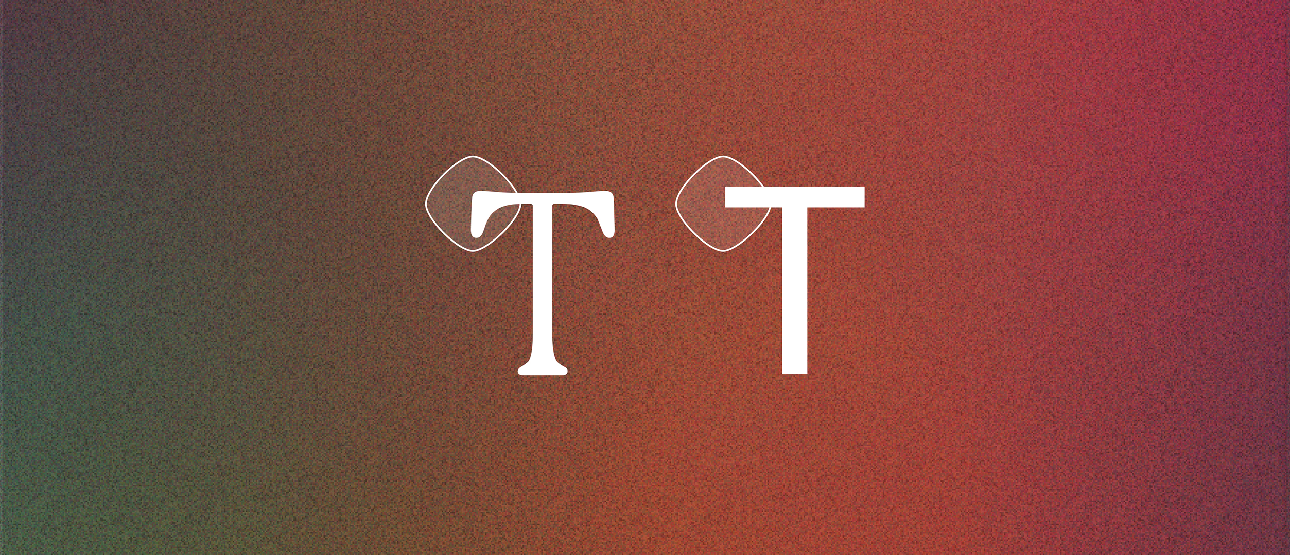
We recommend choosing 2-3 fonts for your nonprofit font kit. Here’s what you need, and why:
1. Primary type
This is your main header font. It shows up wherever you make a bold statement with just a little text: homepage hero text, headings in print or digital collateral, etc. This one should be decorative (think eye-catching, not utilitarian) and, as always, brand-specific. This is the font that should make your target audience immediately think of your organization.
2. Secondary type
Complementary to your primary type, your secondary type is a second opportunity for visually-striking typography that aligns with your brand mission and values. But most importantly, your secondary type needs to be legible and accessible for long body copy. This is where a good, utilitarian font comes in. If you’ve used a serif as your primary type, this may be the right moment to consider a sans serif: something readable, accessible, and easy to digest.
3. Tertiary type
A third font in your font kit can serve as a supplement to your primary and secondary type. While it won’t show up in every space that your brand does, it may feature in a campaign or side project – think: collateral or a detailed moments on your website like a chart, graph, or sub-header) – a moment where you may want a fresh look that’s still cohesive with your brand. This font can come in handy when you want to shake things up, while still staying true to your core visual identity.
How do you know the fonts go together?
If you don’t have an in-house design team (or even if you do), it may be helpful to tap some expert advice from a creative agency. A gut-check can give you a good sense of effective font pairings, but someone with expertise in design best practices will be able to create font pairings that are not only visually stunning, but that also resonate with your audience.
Missed our first two posts on typeface & fonts? Check out: How to choose a typeface for your nonprofit’s brand identity and What to avoid when choosing a typeface for a nonprofit’s brand identity.