
This blog is part of a three-part typeface & fonts series. Check out parts one and three: How to choose a typeface for your nonprofit’s brand identity and How many fonts your nonprofit organization should have – and why. Do you have a branding project in mind? We’d love to hear about it.
Choosing a primary typeface – fonts (sizes, weights, styles) – for your nonprofit brand identity can be tricky. It helps to create time and space for exploration in order to select a typeface that reflects your organizational attributes (more on this in Part 1).
In addition to internal reflection, it may also help to look around for inspiration: finding brands you like and dislike, or auditing organizations that work in a similar field. However, while comparative research is important, outright comparison can be detrimental to your brand. Your organization is unique. Your brand – and your typeface – should reflect that. Here are a few pitfalls to avoid as you choose a primary typeface for your brand:
1. Beware of the bandwagon
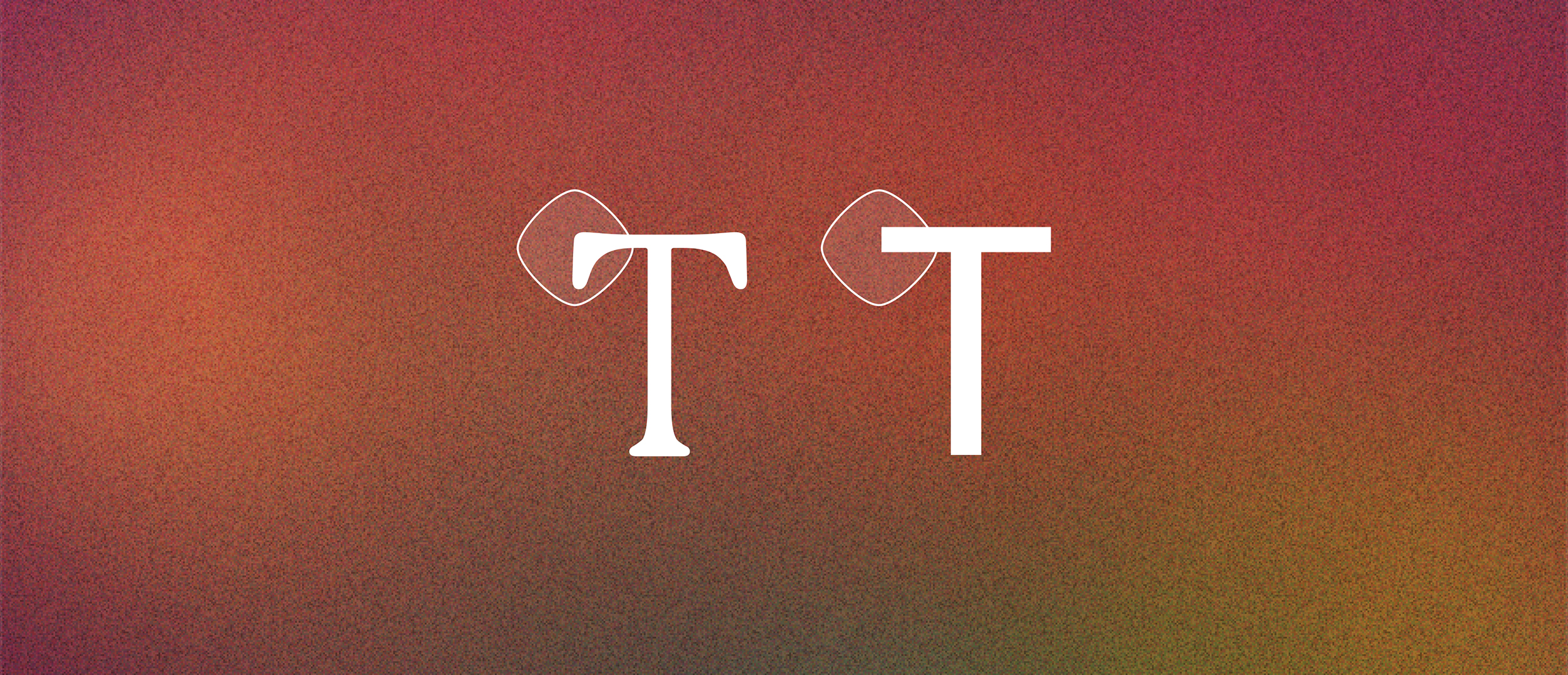
Typeface trends come and go. Serifs and sans serifs (fonts with and without decorative strokes, respectively), for instance, go in and out of vogue.
Sans serif fonts are often modular, based on shapes like circles or squares (creating a nice opportunity to echo shapes in your logo), and they tend to be more versatile than serif fonts. However – they are extremely popular right now.
The lion’s share of brands have transitioned to sans serifs over the last decade, homogenizing type across industries. Because of this, serifs may be due for a rebound.
Think about how to select a typeface that works now, but also considers shifting trends, and that is most importantly – true to your brand.
2. Don’t be a copycat
In a similar vein, beware of imitation. A sure way to diminish your brand is to copy someone else’s. Just because you work in human rights doesn’t mean your branding should mirror other human rights organizations – the opposite may be true: You may benefit by selecting a Typeface that sets yourself apart. If you frame your choices around what makes your organization unique, you’ll also avoid the need for continual rebranding.
3. Consider connotations of typeface and fonts among your audiences
When it comes to typeface selection (as with just about every other aspect of nonprofit communications), the deeper the understanding you have of your audience, the better. While a typeface may convey certain general, broadly felt characteristics (like boldness or friendliness), it also may carry hyper-specific cultural connotations.
Think of the infamously goofy Comic Sans (a pop culture icon among Millennials and Gen Z, and upheld for its accessibility by others) or Times New Roman (which brings back memories of grade school essays among the same audiences). Having a background in design history, an ear toward popular culture, and a deep understanding of your audiences are key to understanding what will resonate.
Ready for next steps? Check out the next blog in our typeface & fonts series for more on how many fonts your nonprofit brand identity should have.