
This blog is part of a three-part typeface & fonts series. Check out parts two and three: What to avoid when choosing a typeface for a nonprofit’s brand identity and How many fonts your nonprofit organization should have – and why. Do you have a branding project in mind? We’d love to hear about it.
Choosing the right typeface – a collection of fonts (sizes, weights, styles) – for a nonprofit brand identity is no small task. With thousands of typefaces to choose from, finding the perfect primary typeface can feel like finding the best-looking needle in a haystack. How do you begin? A creative agency can help make this task less overwhelming. But if you choose to go-it-alone, here are a few things to keep in mind:
1. Consider your brand attributes: the essence of your organization
Your organization’s typography is an expression of your voice – no less important than tone and content. Think about what characterizes your nonprofit organization: Are you authoritative? Bold? Compassionate? When you have a clear, compelling, and truthful sense of your own identity, you can then seek out a typeface which embodies those attributes.
Typefaces have their own personalities (think ‘cogent’ for DIN, ‘approachable’ for Avenir, and ‘authoritative’ when it comes to Gotham). It’s important that the personality of your typography jives with the personality of your organization.
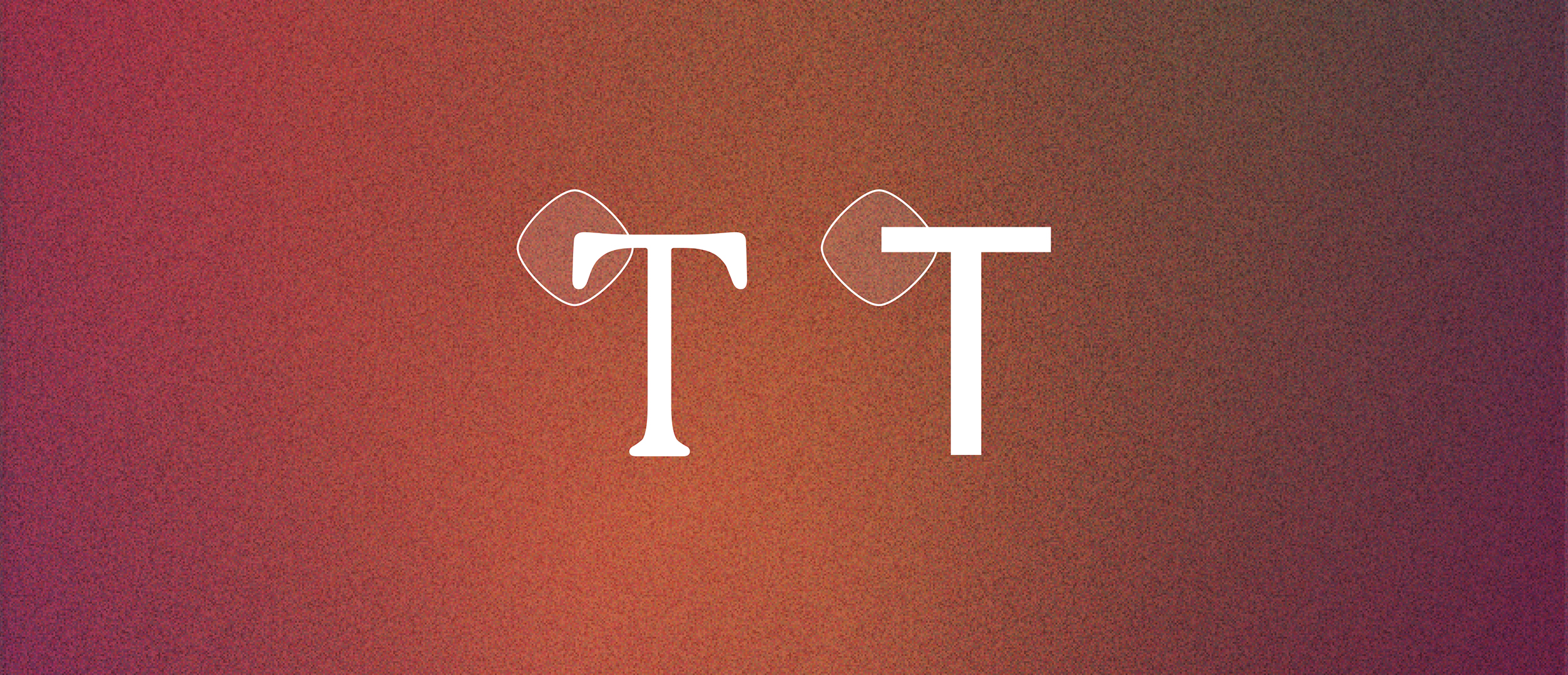
2. Draw inspiration from your logo
If you already have a logo or mark that works for you, it may provide a helpful starting point for selecting your typeface. Consider selecting a primary typeface that echoes the shapes, curves, or lines of your logo. Is your logo geometric? If yes, consider a modular, shape-based typeface. If your logo has a more organic feel, look for typefaces with soft edges and curves.
3. You can always start with the basics
If diving into the nitty-gritty-design-focused details is intimidating, you can always simplify the process: Choose a basic typeface as a starting point for exploration. Ultimately, you’ll probably opt for something a bit more distinctive, but looking at a few tried-and-true typefaces will give you a sense of your likes and dislikes, how you feel about serif vs. sans serif, as well as font pairings (more on how many fonts your nonprofit type kit should have in Part 3).
Here are some great typefaces to explore, if you don’t know where to start:
- Serifs: Garamond and Baskerville can pair well with most sans serifs.
- Sans serifs: Montserrat, Proxima Nova, and Avenir are go-to, basic-yet-cool sans serifs.
Ready for next steps? Check out the next blog in our typeface & fonts series for more on what you should avoid when you’re selecting a typeface for your nonprofit’s brand identity.